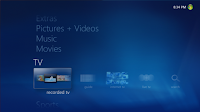
Turbo Scroll also puts in an appearance for Pictures for a nice enhancement in large libraries – hold down the left or right buttons on the remote to transition into a user experience which allow you to fast forward through pictures – let go of the button to move to that point in the gallery.
I’ll take a moment to note the static screen captures here don’t really do Turbo Scroll justice – the animations are quite nice.
Picture Details bubbles up many of the simple photo editing features in Windows Media Center as well as allows you to rate the picture.
In prior versions the slideshow disappeared from view when you pressed the Green Button and the only way to return was to use the back button (if the slideshow was still on the backstack) or go back through the library to start fresh.
Now the slideshow is persisted as an experience in Now Playing including picture transitions – you can select to easily return back to the full screen slideshow. [That’s me taking on Ruby Beach taking pictures – shameless self-promotion, sorry.]
Videos.
I've elected to not take any screenshots for this section -- not much has changed visually for this feature, so I'll just enumerate what's new from a functionality perspective.
For starters, you get all of the enhancements made available with the TV Pack (including those for United States customers). For more information on the TV Pack check out this post at The Green Button: http://thegreenbutton.com/forums/thread/282555.aspx. If you recall, the TV Pack was designed to enable TV standards in Asia and Europe. There are some nice additions in this area for Windows 7...
When you move your mouse you will notice the seek bar looks a little different. It's now 'clickable' which will take you to that relative position in the content. Many folks use the mouse with Windows Media Center and this feature has been wanted by that group for a while. [Note: This also works for content in the Video Library.]
When Recorded TV (or video) is playing and you press the right or left arrow buttons you get the Now Playing experience which bubbles up features and functionality previously buried behind the More Information button (like Zoom) or Settings (Captions) as well as information and details (like related content) from the guide. (Those of you with access to Internet TV in the United States may find this familiar -- an earlier incarnation of this approach was used for that experience.)
Not much has changed in the Recorded TV gallery from a look and feel standpoint, but this screen capture does show the new 'All Content' view available with Shared Libraries. If you have multiple Windows Media Center enabled PCs in the house you can now enjoy that content across the network on those computers without going to great lengths to hack registries and apply folder sharing voodoo.
Selecting a Recorded TV show will bring up the new Details experience -- as with other experiences in this shared feature, go left and right to switch between panes.
Here is the guide in Turbo Scroll mode (hold down the left or right arrow button on your remote control or keyboard). Note the correct high definition channel mapping from the TV Pack as well as the [ HD ] logo embedded in the grid entries.
Selecting an item in the guide also brings up the new details. Note the new [ HD ] logo which helps you identify high definition content. The slide and pane metaphor really begins to shine with TV (and movies) because it does such a great job of putting resources once buried across many screens 'closer' to you.
Movies.
You'll notice the Movies experience has now been given a strip of its own with a few enhancements.
The improved Movies Guide has an [ HD ] pivot which makes finding that visual fidelity much easier.
Movie Details again brings many layers of pages into a single location -- it's now much easier to jump around and find related content.
Extras.
We've listened to our developers and I'm happy to announce a new feature called 'Extras' which will be replacing Online Media. I'll have a post out in the next couple of days with more information on this 'still in the planning phase' feature. As part of the rethinking of this area of the produce we've greatly simplified the gallery to make it much more user friendly. Gone are the myriad of [seemingly random] pivots (which were really filters).
Now this gallery behaves much like the others in the product whereby the pivots are sorts and all of your applications are represented in each view.
I don’t really have a screen capture of this next one but it’s worth noting: Application developers (more for you folks in a separate post) will be happy to know we’ve increased the number of custom Start Menu strips to a maximum of 20 (up from only 2 in Windows Vista).
On Screen Keyboard.
Any time you need to perform text entry we've got a new on screen keyboard for your enjoyment. This feature alone will bring much 'Spousal Acceptance Factor' to your Windows Media Center experience. [Bonus: This same exact on screen keyboard is available for developers to invoke from their applications.]
Gadget.
This is the gadget in its default configuration allow you to play your favorite music, slideshow (3 stars or better) or both. You can click the green button to launch Windows Media Center.
If you've configured TV and recorded shows they will appear in the order they are recorded. The gadget can also include content from the Internet TV feature.
Here are the gadget settings. Turning off Internet TV and New Recorded TV will return the gadget to it's default, out of box configuration.
I’ll take a moment to note the static screen captures here don’t really do Turbo Scroll justice – the animations are quite nice.
Picture Details bubbles up many of the simple photo editing features in Windows Media Center as well as allows you to rate the picture.
In prior versions the slideshow disappeared from view when you pressed the Green Button and the only way to return was to use the back button (if the slideshow was still on the backstack) or go back through the library to start fresh.
Now the slideshow is persisted as an experience in Now Playing including picture transitions – you can select to easily return back to the full screen slideshow. [That’s me taking on Ruby Beach taking pictures – shameless self-promotion, sorry.]
- The Video Library, like Pictures, Music and Recorded TV gets the Shared Library feature so you can enjoy content from other computers on your network.
- H.264 playback is now supported out of the box with Windows 7 -- including on Media Center Extenders – both standalone hardware implementations AND on the XBox 360 when in Extender mode. I know a few people on http://www.thegreenbutton.com who will rejoice.
- Video Play All allows you to play all of the videos in a specific gallery in a continuous play list – you can now easily excite the neighbors with your vacation and home videos one after the other!
- Videos now have parity with Recorded TV in the area of bookmarks – you can now resume previously played videos where you left off.
Not much has changed in the Recorded TV gallery from a look and feel standpoint, but this screen capture does show the new 'All Content' view available with Shared Libraries. If you have multiple Windows Media Center enabled PCs in the house you can now enjoy that content across the network on those computers without going to great lengths to hack registries and apply folder sharing voodoo.
Movie Details again brings many layers of pages into a single location -- it's now much easier to jump around and find related content.
Extras.
We've listened to our developers and I'm happy to announce a new feature called 'Extras' which will be replacing Online Media. I'll have a post out in the next couple of days with more information on this 'still in the planning phase' feature. As part of the rethinking of this area of the produce we've greatly simplified the gallery to make it much more user friendly. Gone are the myriad of [seemingly random] pivots (which were really filters).
Now this gallery behaves much like the others in the product whereby the pivots are sorts and all of your applications are represented in each view.
I don’t really have a screen capture of this next one but it’s worth noting: Application developers (more for you folks in a separate post) will be happy to know we’ve increased the number of custom Start Menu strips to a maximum of 20 (up from only 2 in Windows Vista).
On Screen Keyboard.
Gadget.
If you liked this article, subscribe to the feed by clicking the image below to keep informed about new contents of the blog:
La FrenchTv box vous propose les chaînes de la TNT française en décalées sur le continent Américain et Amérique latine.
ReplyDeletefrench tv