 Windows Media Center
 (codenamed "Freestyle" during development) is an application with a 10-foot user interface design to serve as a
home-entertainment hub for the living-room TV.
It is included in Windows XP Media Center Edition, premium editions of Windows Vista (Vista Home Premium and Vista Ultimate), and Windows 7 (Home Premium, Professional, Enterprise, and Ultimate).
It is designed to be controlled by special
remote controls which prominently feature the Green Button (similar to the logo to the right), but can also be operated with a mouse and/or keyboard.
This button is used to either launch Media Center from Windows or to return to the Start Menu from within the application. Media Center plays the computer user's
pictures,
videos, and music from local
hard drives,
optical drives, and network locations. It then categorizes them by name, date, tags, and other file attributes. Media managed through Media Center can also be relayed via a home network to standard TV sets via the specially designed Windows Media Center Extender or the Xbox 360.
Start Menu
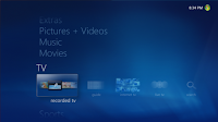
The Start Menu gets a subtle refresh both in text treatment and iconography size. You can now see more items at any given time without feeling cluttered, and the readability has really improved. The new Start Menu is also designed to always overlay the current playing experience so it stays in one place. Another thing you will notice is it now remembers your last location strip between sessions (prior versions always launched to the TV + Movies strip).
We got a lot of complaints about the postage stamp size of the video thumbnail for Now Playing in Windows Vista. You’ll be pleased to note it has returned to its larger size in Windows 7 -- no more squinting! Another thing you will notice in this screen capture is the tile title has been moved out of the focusable rectangle -- we can now do much longer names as a result (a great usability enhancement for international versions of Windows Media Center where the languages make for really long titles).
Music.
The user friendliness and design ethos really moves a notch up, especially for those with large libraries. [Note: Some of the user experience enhancements transcend any singular Windows Media Center area – I’ll introduce them throughout this post and try to note when the feature is shared.]
Do you have obscure albums with no album art available? In prior versions all of these would have a blue background + white text. With Windows 7 we mix it up a bit with random colors for these which makes them ‘blend in’ with your other album art for the Music Library gallery.
Details is another shared feature throughout the product. You can think of details as a slide deck which puts much used features closer to your fingertips compared to prior versions. You move left and right to switch between panes and up and down to select items on that pane. This really bubbles up features which have been less than discoverable in the past.
Music Now Playing received a large makeover and I think you are really going to like it. When you start playback of music you navigate to the Now Playing page as in prior versions. After a while we fade out the action items and animate your album art into a slowly scrolling wall of covers and occasionally switch the currently playing album cover and metadata. When you press a button on the remote or move the mouse we bring back the action items and keep the wall of covers up in the background.
Rating your content has never been easier in Windows Media Center. By enabling Rating Shortcuts you can press the 1 through 5 buttons on the remote or keyboard to rate the music (or picture as this is one of the shared features) in real time.
Those folks with large music libraries will *really* like what we call ‘Turbo Scroll’ – another shared feature. When you hold down the left or right remote control buttons for a while we transition into an interface which presents the content in alphabetical chunks. Letting go of the button when you see the letter combination you want will immediately take you to that position in your library.
Shared Libraries are built on top of the Home Group features in Windows 7 and is a shared feature across Music, Pictures, Videos and Recorded TV. Folks who have been clamoring for ‘Softsled’ will very much enjoy this feature as it allows you to peruse and enjoy content from multiple computers on your home network. In this screen capture I’m demonstrating how I can select my local music library or that shared by another user on my network named ‘Ethel’ on a computer named ‘Laptop’. Once selected, I can browse Ethels content in Windows Media Center.
Pictures.
Photo enthusiasts have much to enjoy in Windows 7 in Windows Media Center – like music, the usability goes up a notch or two.
There is a new Ambient Slideshow which will launch as a screen saver as well as when you invoke the new Play Favorites on the Start Menu. This pulls from your pictures rated 3 stars or higher. This slideshow features some nice zoom out (first screenshot) and zoom in animations (second screenshot) as well as slideshows within slideshows (kind of hard to explain -- it makes sense once you watch this new feature in action). If you are a photography fan and want to enjoy your pictures in an unstructured way you are going to really like this feature.
Here is a view of the enhanced Picture Library. I'll draw your attention to the Ratings, Slide Shows and Shared pivots -- all new for Windows 7. Ratings allow you to sort by rating (0-5 stars) like you can with tags we added in Windows Vista. Shared inherits the Shared Library in common with Music, Videos and Recorded TV. On the Slide Shows pivot you can play back slideshows...
...created with the new Slideshow Creator -- one of my favorite features. You can choose pictures or music in the creator and save the results for later playback.
If you liked this article, subscribe to the feed by clicking the image below to keep informed about new contents of the blog:

 Windows Media Center (codenamed "Freestyle" during development) is an application with a 10-foot user interface design to serve as a home-entertainment hub for the living-room TV.


Comments
Post a Comment
Do not insert clickable links or your comment will be deleted. Checkbox Send me notifications to be notified of new comments via email.