 With Windows 8, Microsoft has created an operating system that is, at least in part, genuinely usable with nothing more than fingers. While it took the company a long time to recognize that finger-based touch systems were more approachable than stylus-based ones, and that touch-based software needed to be designed to accommodate the imprecision that fingers imply, Microsoft has its finger-based platform at last with the new Metro-style interface and new Metro-style applications. Office 2013, however, isn't a new Metro-style application.
Instead, the suite contains two Metro-style Office apps: a new OneNote client (that will work alongside a regular desktop version) and a Lync client. Everything else is a desktop application, which poses a problem. Office is an important product for Microsoft and makes up a significant part of the Windows 8 sales pitch. Windows RT, the ARM variant of Windows 8 that will be used on the company's Surface tablets, will ship with Word, Excel, PowerPoint, and OneNote, and the presence of these applications will be one of the big things that sets Windows RT apart from the iPad. For these programs to have any value at all, they have to be touch friendly.
So how did Microsoft do?
Ready to touch
Historically, the Office team never made any concessions to Microsoft's broader tablet ambitions. With the exception of OneNote, the Office apps have never been comfortable for pen users, and it seemed that the Office team was happy with that. That's no longer the case with Office 2013. The suite contains a range of improvements to make finger access better. Across the board, menus created in the main UI are given wider spacing when invoked with fingers. The same is true of the hovering formatting toolbars in Word and Excel; when touching the screen, they're much larger and easier to manipulate.The sizing of the rest of the UI is controlled by a new "full screen" mode that changes the interface to better accommodate touch input. In theory, the applications will use this mode by default when installed on tablet hardware (though they didn't for me on a mouseless Samsung tablet); otherwise, the applications all have a full screen mode button next to the minimize button.

Enlarge / Above, Outlook 2013's ribbon in touch mode. Below, the ribbon in normal mode.
Hit this button and a few things happen. The ribbon, title bar, and quick access toolbar all disappear, replaced by a strip along the top of the window with a "..." either in the center (for OneNote) or on the right-hand side (for everything else). Tap that strip and the ribbon and status bars reappear. The status bar also disappears and similarly reappears when the "..." strip is touched. Windows 8's standard "swipe from the top of the screen" gesture doesn't bring up the ribbon; I think it would be more consistent if it did.

Word's floating toolbar in touch mode, above, and normal mode, below. The same buttons in the same order, just spaced out a little more.
As well as these spacing adjustments, the applications now respond to two-finger zooming. This mainly performs a conventional zoom, but in Outlook's calendar view it does a semantic zoom, allowing you to zoom right in to a single day, or all the way out to a month at a time. To this, Word also adds a tap-to-zoom feature when in Read Mode, to allow tables, images, or other objects to be zoomed in a similar fashion to touch-based browsers.
And... that's about it, the full extent of the finger support that Microsoft has added to Office 2013. If it doesn't sound like much, there's a good reason for that: it isn't. For stylus users, the company says that accuracy has been improved, particularly in OneNote, but using the software with fingers is problematic.
Inappropriate touching
First of all, there's all the stuff that's simply not touch enabled. The options screens, for example. While the drop-down lists do pick up the wider spacing when invoked with touch, that's about the only concession they make: tightly packed checkboxes and radio buttons remain the norm.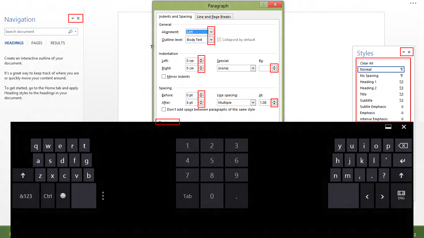
Enlarge / A few examples, boxed in red, of UI elements that don't work on touchscreens. There are many more than just these.
Even worse are the dialog boxes such as Excel's "Format Cells" or Word's "Paragraph." These don't have any concessions to touch control at all. Want to set up an e-mail account in Outlook? You'll be using the same dialogs as you do in Outlook 2010, in spite of their mouse-and-keyboard design.
Microsoft has even added new features in Office 2013 that are inaccessible to touch users. Outlook 2013's "peek" feature, which allows quick glancing at calendar, contacts, and tasks, is invoked with a mouse hover—something that has no analog for touch users.
These are not touch applications, and you will not want to use them on touch systems. They're designed for mice and they're designed for keyboards, and making the buttons on the ribbon larger does nothing to change that fundamental fact.
The Office 2013 apps also highlight more general flaws with Windows 8's touch support of desktop applications. The on-screen keyboard has two modes; it can either be free-floating above the desktop applications, or it can be docked to the bottom of the screen, which forces applications to resize to fit the remaining area. This latter mode is important for accessing, for example, forms that reach the bottom of a webpage, as the form fields would normally lie behind the keyboard.
Used in this docked mode, I found many visual glitches, particularly in Word. Tapping the "..." button to display the ribbon would dismiss the keyboard, but the status bar would then appear mid-way up the screen, as if it were trying to make room for the (now invisible) keyboard. I'm sure such issues are fixable—PowerPoint does quite a good job of making space for the keyboard and ensuring that the text you're editing is visible—but they point to the generic difficulties that Windows 8 has in trying to retrofit touch accessibility to desktop applications.
If you liked this article, subscribe to the feed by clicking the image below to keep informed about new contents of the blog:


No comments: